blog:2019-08-30:new_logo
This is an old revision of the document!
Table of Contents
New Logo!
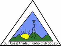
Our old logo presented a few challenges:
- It was wider than it was high (21:16), which made it a bit awkward for some web applications since it didn't fit well in a square.
- It had some very fine details (the tower, the ice cap, the water in the valleys) that din't scale down well.
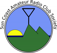
In trying to solve these, I came up with a round alternative:
List of changes:
- Change the overall shape from a triangle to a circle.
- Change the colour of the water to a darker blue.
- Fix the sun, move it behind the water, and remove the rays.
- Remove the snow cap.
- Replace the tower and antenna with a simpler antenna symbol.
- Redraw the mountains using simple triangular shapes.
- Change the colour of the sky to a lighter blue.
Thank you all for your feedback, specially to Stephanie, VA7SLR, who designed the original logo and provided excellent feedback for the new one.
blog/2019-08-30/new_logo.1572197627.txt.gz · Last modified: by ve7hzf


