This is an old revision of the document!
Table of Contents
COVID-19 Spread
I'm not an epidemiologist, doctor, or any kind of expert on the subject so take this with a grain of salt.
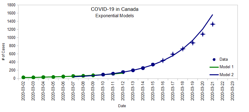
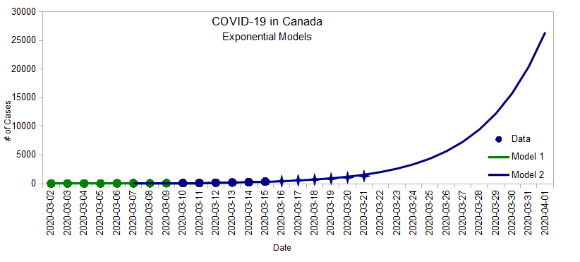
One of the key messages from today's PM announcement is that things will get worse before they get better. I wanted to have a sense of the rate at which COVID-19 is spreading in Canada, so I made a graph, and did some math.1)
First, I got the data from https://www.covid-19canada.com, plotted them on a graph, and tried to use a basic exponential model to extract some key information.
| Date | Count | Date | Count | Date | Count | ||
|---|---|---|---|---|---|---|---|
| 2020-03-01 | ? | 2020-03-08 | 64 | 2020-03-15 | 342 | ||
| 2020-03-02 | 27 | 2020-03-09 | 77 | 2020-03-16 | 441† | ||
| 2020-03-03 | 27 | 2020-03-10 | 95 | 2020-03-17 | 596† | ||
| 2020-03-04 | 33 | 2020-03-11 | 117 | 2020-03-18 | 727† | ||
| 2020-03-05 | 37 | 2020-03-12 | 157 | 2020-03-19 | |||
| 2020-03-06 | 48 | 2020-03-13 | 201 | 2020-03-20 | |||
| 2020-03-07 | 60 | 2020-03-14 | 254 | 2020-03-21 |
† Data from March 16 onward has been added after the original post was written.
There seems to be two different patterns in this two-week period:
- Between March 2 and March 10 (ish) (green line), the number of cases was doubling every 4.1 days.
- But since March 10 (ish) (blue line), the number of cases has been doubling every 2.7 days.
If the blue pattern continues: 2)
- We should have close to 1600 cases by the end of Saturday
- A week after that: over 9000 cases
- By the end of April 1: 26,000 cases (similar to Italy today)
In a very real sense, if we don't do anything different, we could only be about 15 days behind Italy...
But doing the right things can change that future. In reality, the spread of the infection follows a curve like the Logistic Function. The beginning looks like an exponential, but the end flattens out. This is what the news keeps referring to when they say that social distancing and proper hand washing can help “flattening the curve” more quickly.
 The real question is how soon will we reach that middle point.
Here's a good video that explains this sort of math and why being able to think in exponential term is important for non-linear systems such as this one.
And here's another one with different animations that complements it very nicely.
Here's an interesting article from The Washington Post showing basic random simulations for four different cases (free-for-all, attempted quarantine, mild moderate distancing, extensive social distancing).


