Table of Contents
COVID-19 Spread (Part II) Updated
- I'm not an epidemiologist, doctor, or any kind of expert on the subject. I just look at the numbers.
- This was originally written on Sunday March 22nd.
- Jump straight to the latest update.
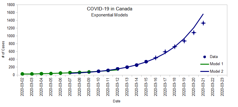
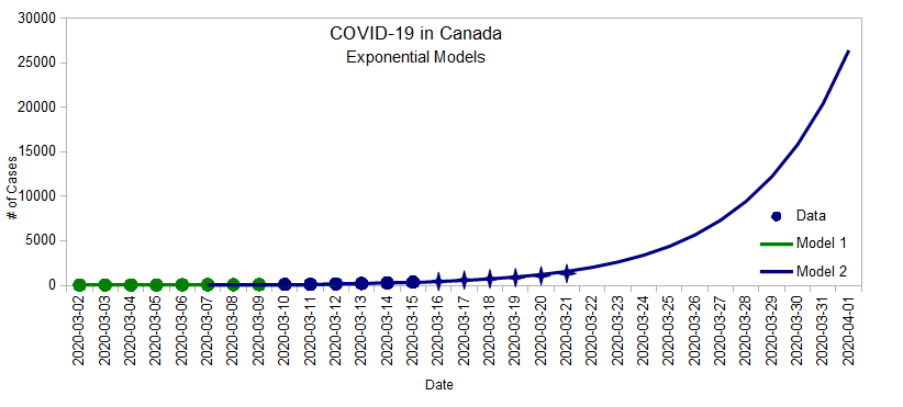
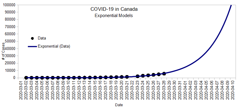
In Part I, I built an exponential model using data between March 2 and March 15, then continued to add daily numbers to see how that model tracked:
Initially, the number of cases doubled every 2.7 days, predicting almost 1600 cases by the end of Saturday March 21, but since Thursday, the infection rate seems to have slowed down a bit and we got about 1331 cases instead. This deviation from the exponential model is what I explore below.
Growth Factor
There's a ratio involving three data points that's useful to track how “fast” the exponential grows. It's easier to explain with an example, so suppose we had three days like this:
| Day | # of Cases | New Cases | Growth Factor |
|---|---|---|---|
| Day1 | 100 | ||
| Day2 | 110 | 10 | |
| Day3 | 130 | 20 | 2 |
To calculate the growth factor:
- Take the number of new cases from one day to the next (10 new cases from Day 1 to Day 2, 20 new cases from Day 2 to Day 3)
- Then, take the ratio between new cases (20 ÷ 10 = 2)
- If the growth factor > 1, the number of new cases is itself increasing each day, which means we are still in the exponential phase.
- If the growth factor = 1, then the number of cases is growing at a constant rate (same amount each day). This is the middle of the Logistic Curve (more on that soon).
- If the growth factor < 1, then the infection rate is levelling off.
- If the growth factor = 0, then the epidemic is over.
Here are the number of cases in Canada with the calculated growth factors:
March
| Date | # of Cases | New Cases | Growth Factor |
|---|---|---|---|
| 2020-03-01 | ? | ||
| 2020-03-02 | 27 | ||
| 2020-03-03 | 27 | 0 | |
| 2020-03-04 | 33 | 6 | |
| 2020-03-05 | 37 | 4 | 0.67 |
| 2020-03-06 | 48 | 11 | 2.75 |
| 2020-03-07 | 60 | 12 | 1.09 |
| 2020-03-08 | 64 | 4 | 0.33 |
| 2020-03-09 | 77 | 14 | 3.25 |
| 2020-03-10 | 95 | 18 | 1.38 |
| 2020-03-11 | 117 | 22 | 1.22 |
| 2020-03-12 | 157 | 40 | 1.82 |
| 2020-03-13 | 201 | 44 | 1.10 |
| 2020-03-14 | 254 | 53 | 1.20 |
| 2020-03-15 | 342 | 88 | 1.66 |
| 2020-03-16 | 441 | 99 | 1.33 |
| Date | # of Cases | New Cases | Growth Factor |
|---|---|---|---|
| 2020-03-17 | 596 | 155 | 1.57 |
| 2020-03-18 | 727 | 131 | 0.85 |
| 2020-03-19 | 873 | 146 | 1.11 |
| 2020-03-20 | 1087 | 214 | 1.47 |
| 2020-03-21 | 1331 | 244 | 1.14 |
| 2020-03-22 | BC did not report its numbers on March 22. | ||
| 2020-03-23 | 2091 | 380 | 1.56 |
| 2020-03-24 | 2792 | 701 | 1.84 |
| 2020-03-25 | 3409 | 617 | 0.88 |
| 2020-03-26 | 4043 | 634 | 1.03 |
| 2020-03-27 | 4757 | 714 | 1.13 |
| 2020-03-28 | 5655 | 898 | 1.26 |
| 2020-03-29 | BC did not report its numbers on March 29. | ||
| 2020-03-30 | 7448 | 897 | 1.00 |
| 2020-03-31 | 8591 | 1143 | 1.27 |
April
| Date | # of Cases | New Cases | Growth Factor |
|---|---|---|---|
| 2020-04-01 | 9730 | 1139 | 1.00 |
| 2020-04-02 | 11283 | 1553 | 1.36 |
| 2020-04-03 | 12549 | 1266 | 0.82 |
| 2020-04-04 | 14018 | 1469 | 1.16 |
| 2020-04-05 | BC did not report its numbers on April 5. | ||
| 2020-04-06 | 16667 | 1325 | 0.90 |
| 2020-04-07 | 17897 | 1230 | 0.93 |
| 2020-04-08 | 19290 | 1393 | 1.13 |
| 2020-04-09 | 20765 | 1475 | 1.06 |
| 2020-04-10 | 22148 | 1383 | 0.94 |
| 2020-04-11 | 23318 | 1170 | 0.85 |
| Date | # of Cases | New Cases | Growth Factor |
|---|
There's a lot of variation in the growth factor because real life is messy. It's also worth keeping in mind that the numbers we see are contingent on how much testing we do. It's easy to imagine that testing labs are lagging a few days behind and that they'll sometimes be able to report more results one day and less the next.
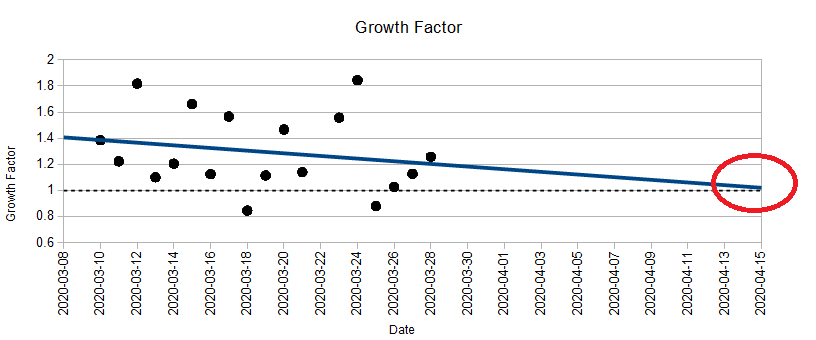
We don't have an accurate picture of the world here so it's hard to make any kind of hard predictions. Never-the-less, as of March 21, there seemed to be a loosely decreasing pattern:

Overall, the growth factor is mostly above 1 (in the exponential phase), but it looks like we might be on track to reach 1 by the end of the month (end of exponential phase). If that's the case, and if we continue to implement measures to slow the down the spread, then we'll be in a better position to estimate the final outcome by the end of the month. Here's why.
The Logistic Curve
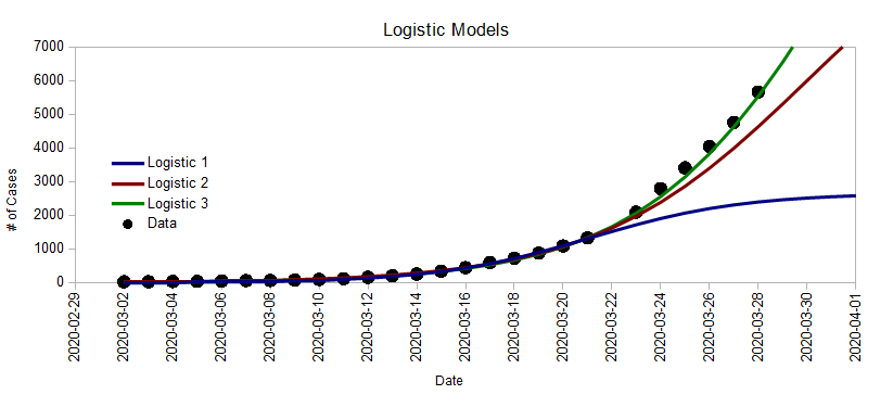
In Part I, we saw that very different Logistic Curves can fit the current data, and that there's really no way of knowing which path we're on yet. Here they are again:
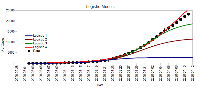
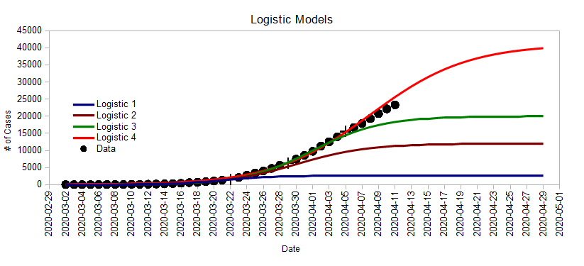
- Logistic 1 was the very best case scenario (as of March 22) where the total number will be double of what it is today. This assumes that the growth factor reached 1 yesterday (March 21), which it hasn't. But we're way passed that now.
- Logistic 2 is an optimistic scenario where the total number reaches 12,000 and the growth factor reaches 1 on March 30st.
- Logistic 3 is a very likely scenario where the total number reaches 20,000 and the growth factor reaches 1 on April 1st. This is not a worst case scenario. Things could be much worse (look at Italy).
Here are a few things to know about the Logistic Curve. In the middle:
- The curve is flat like a straight line, which indicates that the growth rate is constant.
- This means that the growth factor is 1 (by definition)
- It also happens that this is the halfway point in terms of total number of cases.
So once we reach that point, we'll be able to get a better estimate of where we'll end up. Until then, things are still very much in the air.
March 28th Update
A lot happened this week:
- BC seems to be dropping the ball on testing. Their reported numbers are proportionally much lower than Quebec and Ontario and the messaging is that we might finally be “flattening the curve”. However, it could simply be that we are not testing enough and are way behind on reporting results. On a personal note, I finally got my result yesterday (negative): three weeks after getting tested!
- Quebec went the opposite way, increasing their testing and finding a lot more cases.
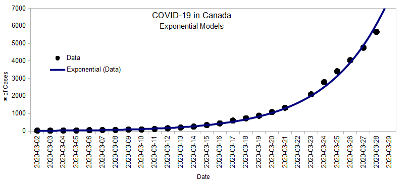
Over all, it looks like we are back on the exponential curve with an overall doubling time of 3.1 days:
The Growth Factor also seems to support this as it is barely decreasing. Again, a Growth Factor of 1 means that we could be at the half-way mark. As long as it's above 1, we don't know...
Over a week ago, back when we only had 342 cases, the model (at the time) predicted we were about two weeks behind Italy (which had 26,000 then).
The updated model (doubling every 3.1 days) predicts that we are about 12 days behind Italy (with now has over 92,000 cases). Whatever we have been doing is either not working or we are not seeing the effects yet.
According to the CBC from March 25th:
“Dix and provincial health officer Dr. Bonnie Henry both said they are optimistic B.C. isn't following the same path as countries like Italy that have seen their healthcare systems overwhelmed by huge spikes in hospitalizations and deaths.”
Country-wide, the numbers disagree. We have about two weeks behind Italy since the beginning of March. Province-wide, the numbers do look better, but it could well be because we are not testing as much as other provinces like Quebec and Ontario. There are no reasons to be optimistic about being on a different path.
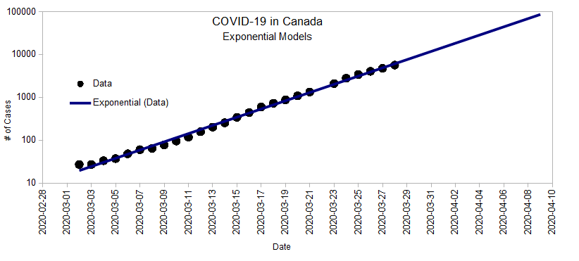
Here's a different way to look at the exponential curve when the number of cases is presented as a multiple of 10 on the vertical axis (called a logarithmic scale):
If we stay on that line, we'll reach 100,000 cases by April 10th!
Cleaning Groceries
Here's a video shared by the Mid Island Radio Group:
Other Models
Compartmental Models are popular such as the SEIR (Susceptible, Exposed, Infected, Recovered) Model. https://en.wikipedia.org/wiki/Compartmental_models_in_epidemiology#The_SEIR_model
Kaggle has a modelling competition which has some good data sets. You need to use a Google ID to access this (I think since Google brought Kaggle a few years ago). https://www.kaggle.com/c/covid19-global-forecasting-week-3
April 3rd Update
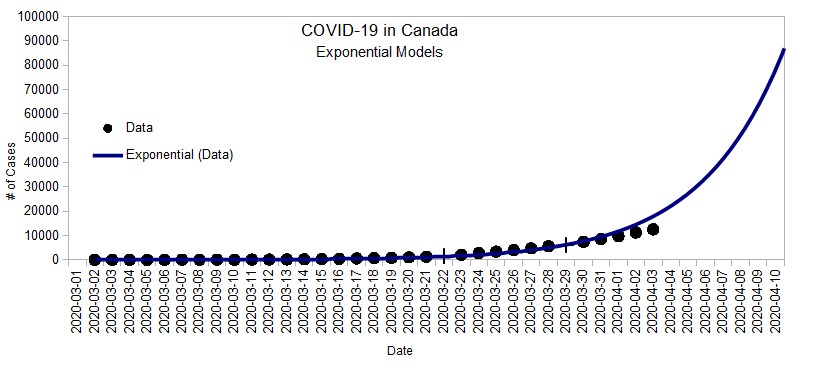
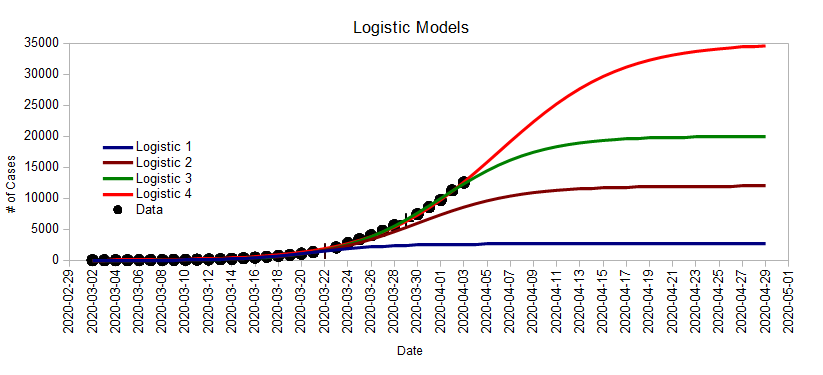
Hard to believe that a month ago, there was only 27 reported cases in Canada (compared to 12,549 cases today). It looks like BC is still vastly under testing so the actual numbers are probably much higher than they appear to be. However, looking at what's reported, it looks like we could be nearing the halfway mark:
For the last week, the infection rate seems to be flatter than it has been.
With the same physical distancing measures in place, it looks like we could see between 20,000 and 35,000 cases. But the future is still highly unpredictable precisely because it is up to us.
I've also said a few times that BC is way behind on testing and that the numbers we see are vast underestimates. This CBC article, Why COVID-19 testing varies so much across Canada, dives into this issue somewhat. It would be nice if, in addition to the number of new cases reported, each province also had to report the number of tests that were analyzed that day. It would give us a much better sense of how everyone is doing. For example, if Quebec is testing 10 times more than BC is, it's not surprising they are finding more cases. That's just an example because I don't know how much more they are testing. If anyone finds that information somewhere, please share it here!
On a lighter note, xkcd puts this whole post into context:
“Remember, models aren't for you telling facts, they're for exploring dynamics.
This model apparently explores time travel.”
April 12th Update
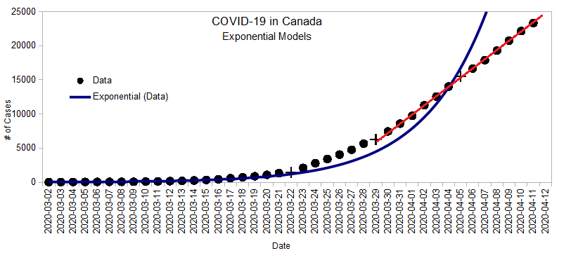
It's been over a week since the last update and according to the numbers, it looks like we are off the Exponential curve...
... and into the linear middle section of the Logistic curve:
The calculated Growth Factor also seems to have dipped below 1:
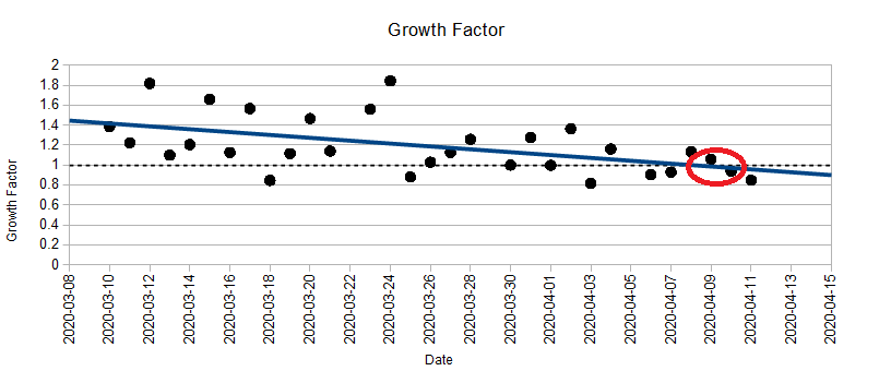
Again, recall that:
- If the growth factor > 1, the number of new cases is itself increasing each day, which means we are still in the exponential phase.
- If the growth factor = 1, then the number of cases is growing at a constant rate (same amount each day). This is the middle of the Logistic Curve.
- If the growth factor < 1, then the infection rate is levelling off.
- If the growth factor = 0, then the epidemic is over.
Evidence and Certainty
I am still very skeptical that these numbers are an accurate description of our current situation so I feel like I have to explain an apparent contradiction here:
Why is it that back in March, I seemed to trust the numbers when they said that the virus was spreading exponentially, but now I seem to distrust the numbers when they say that the infection rate is finally levelling off? Am I just a pessimist regardless of what the evidence says?
The quick answer is no. The way evidence works is not symmetrical. For example: imagine you think you might have mice in the basement, so you setup a few traps:
- If you catch a mouse, you can, with 100% certainty, say that there was (at least) one mouse in the basement.
- If you don't catch anything, you can't say anything with 100% certainty. Maybe there isn't one, but maybe there is and you just didn't catch it.
So back in March, the reported cases grew exponentially, so I could say with 100% certainty that the virus was spreading exponentially (although maybe at a faster rate than reported). Now, the reported cases seem to be growing linearly (the curve is flattening). But there are two possible explanations for this:
- The infection is actually flattening out (I really hope and wish this is the case), or
- The amount of testing we do is insufficient and we are not recording the actual spread of the virus (this might very well be the case).
It's hard to say exactly which of these it is because the provinces aren't releasing the daily number of tests they perform (or if they do, I haven't found them anywhere). But there is some evidence pointing to a lack of testing. One of them is if we compare the number of deaths for each provinces relative to the number of cases reported. Here are the numbers from yesterday for BC, Alberta, Ontario, and Quebec:
| Province | Cases | Deaths | Death Rate |
|---|---|---|---|
| BC | 1445 | 58 | 4.0% |
| AB | 1569 | 40 | 2.5% |
| ON | 6648 | 253 | 3.8% |
| QC | 12292 | 289 | 2.4% |
The number of cases and the number of deaths are reported daily. The Death Rate is a calculation:
\text{Death Rate} = \frac{\text{\# of Deaths}}{\text{\# of Reported Cases}}
Another way to think of this is: for every 100 reported cases, how many people die?
From this, we see that BC has 4 deaths per 100 reported cases, where as Alberta has 2.5 deaths per 100 reported cases. This suggests that there are a lot more unreported cases in BC since the death rates should be relatively similar across the country.
What we hear from the news also supports this: Alberta is being praised for the high number of tests they are performing (and their death rate is low) while Ontario is being criticized for the opposite (and their death rate is high).
Unfortunately, the number of deaths lags about 2 to 3 weeks behind the number of real cases so using it as a metric is not practical. And so we're back to the importance of testing lots if we want a clear picture of the situation.
A Letter to Dr. Henry
Yesterday, I sent the following letter to Dr. Henry:
Dear Dr. Henry,
I live in a small community on the Sunshine Coast. My work has been deemed an essential service (maintaining phone and internet connections for residents here), and my spouse is a nurse in the community.
I was very happy to hear your recommendation for people to stay home over the long weekend. My wife explained to me that our local hospital absolutely does not have the resources to deal with this outbreak, as we normally send complex cases to the mainland for more intensive treatments. Our only chance here is to keep the pandemic from reaching us.
Unfortunately, the reality is that a lot of people are not following your recommendations (see this CBC article from yesterday). I wish that appealing to people's common sense was enough, but it's wishful thinking to think that everyone will follow recommendations that are not passed into law. Most people have common sense enough to respect the speed limit when they drive, but we still have enforceable laws for the few that don't.
I implore you. Please, add teeth to the excellent recommendations that you have. There will always be people who:
“[A]cknowledged locals' concerns, but said they weren't enough to cancel the trip: “I'm not too worried. Bring in a helicopter to take us out [if we get sick],” he said.”
Clearly, there are people who only think of themselves and not the small communities they could be impacting.
I know that you know that it only takes a few people to start a pandemic. Only a month ago, there was 117 reported cases across the country, we are now at over 22,000.
Please stop appealing to the majority of people's common sense, and start controlling the small minority who could have a disastrous effect on the rest of us. We need a speed limit, and cops to enforce it.
Thank you,
Patrick Truchon
And this morning, a new article came out about how the “Delta police have 'no powers' to stop meetings of COVID-19 conspiracy theorists”; which further supports the need for enforceable legislation.
Unfortunately, Dr. Henry doesn't seem to think that it's a problem: Reports of crowded ferries 'overblown'.
April 17th Update
I finally found a key piece of data1) that I had been missing since the beginning: the number of tests performed by different provinces.
Here's a summary of the four most populous provinces as of the end of yesterday:
| Province | Tests | Cases | Deaths | Population (Millions) | Cases / Tests | Death / Cases | Tests / Million | Cases / Million | Death / Million | |
|---|---|---|---|---|---|---|---|---|---|---|
| BC | 59185 | 1575 | 77 | 5.111 | 2.7% | 4.9% | 11580 | 308 | 15 | |
| AB | 85502 | 2158 | 50 | 4.413 | 2.5% | 2.3% | 19375 | 489 | 11 | |
| ON | 128093 | 8961 | 423 | 14.712 | 7.0% | 4.7% | 8707 | 609 | 29 | |
| QC | 151510 | 15857 | 630 | 8.538 | 10.5% | 4.0% | 17745 | 1857 | 74 | |
That's a lot of numbers so let's unpack this table a bit:
- The “Tests”, “Cases”, “Deaths”, and “Population” columns are raw data.
- The other columns are calculations:
- “Cases / Tests” is the percentage of tests that come back positive.
- “Death / Cases” is the number of death for every 100 reported cases.
- “Tests / Million” is the number of tests performed per million people in each province.
- “Cases / Million” is the number of reported cases per million people in each province.
- “Deaths / Million” is the number of deaths per million people in each province.
So let's compare these four provinces.
Number of Reported Cases
If we look at the total number of reported cases, it looks like BC is doing the best and Quebec is the worst:
- BC: 1575 cases
- AB: 2158 cases
- ON: 128093 cases
- QC: 151510 cases
If we take these numbers and scale them to take account of each provinces' population, the rank is still the same (although we can see that Quebec is doing three times worse than Ontario):
- BC: 308 cases / million
- AB: 489 cases / million
- ON: 609 cases / million
- QC: 1857 cases / million
It would be tempting to stop there, but the problem is that not every province is testing the same. This means that some provinces might have a more realistic view of the infection rate than others.
Death Rate
The first clue to this is to look at the number of deaths per hundred cases:
- AB: 2.3 deaths per 100 reported cases.
- QC: 4.0 deaths per 100 reported cases.
- ON: 4.7 deaths per 100 reported cases.
- BC: 4.9 deaths per 100 reported cases.
This time, the ranking is very different as BC went from being first to being last. There are a few different things that could explain this:
- Maybe in Quebec, Ontario, and BC, it's the most vulnerable population that contracted the virus, leading to more deaths.
- Maybe Alberta has unusually successful treatments for people infected.
- Maybe different provinces are not reporting their infected cases in the same way.
We would expect some variation, of course, but for BC to be #1 when it comes to having the fewer number of cases, and then the worst when it comes to the number of deaths / reported cases suggests that we are under-reporting.
Number of Tests
After over a month of looking at these numbers, we finally got access to the number of tests being performed. If we look at the number of tests / million people, we get the following ranking (the higher the better):
- AB 19375 tests / million
- QC 17745 tests / million
- BC 11580 tests / million
- ON 8707 tests / million
Unsurprisingly, Alberta is the best, closely followed by Quebec(!) and trailing behind is BC and Ontario.
Per capita, Alberta has tested 1.7 times more than we have so far. So it would be reasonable to estimate that if we had tested 1.7 times more, we could have found 1.7 times more cases, which would have brought our total from 1600 cases to 2600 instead. This would in turn have lowered our death rate from 4.9% to 2.9%, which is closer to Alberta's 2.3%.
Positive Result Rate
Another number that is very interesting to look at is the number of positive cases per 100 tests performed. Here, it's not obvious what's good:
- A low number could mean that we are testing uninfected people just to make sure (health care workers for example). But it could also mean that we are sending infected people home to self isolate without testing them (the way BC has been doing it for weeks now).
- A high number could mean that we are testing people that are more obviously infected. But it could also mean that we are not testing enough people “just to make sure”.
At any rate, There's a clear divide between the west and the east here and I'm not sure what to make of it.
- AB: 2.5%
- BC: 2.7%
- ON: 7.0%
- QC: 10.5%
Conclusion
One of the main conclusions from this is that, as suspected, BC is behind on testing (and Ontario is worse) and until we start ramping up on testing, we just can't judge how good (or bad) the situation is. Any future changes to the current physical distancing measures will be made in the dark.

